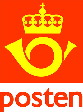
the Norwegian mail service have a new logo. The old red horn and the king's crown are on the garbage heap. Fine. I don't know how much they paid for this: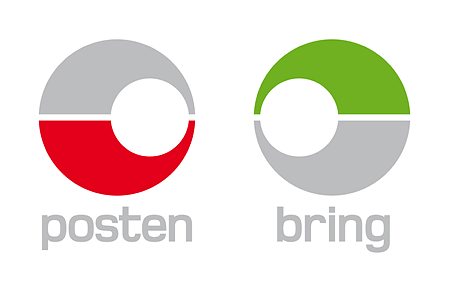
Two circles, one red for the regular post service, and one green for business services (I think). But where did they come up with this innovative design?? How many people thought in think tanks?
Or did they just steal the look of the pokemon ball?
the ball is used for storing pokemon and now it's also the new logo for Posten.
Great.
Tone Hansen has a great essay on branding, name changes and new logos in Norway. Check it out.
Sunday, November 02, 2008
new pokemon logo
Subscribe to:
Post Comments (Atom)

1 comment:
hahaha
great
Post a Comment